Showing posts with label decorating. Show all posts

11.13.2012

Industrial Shelving Displays

Pin It Print Friendly and PDF

Almost a year ago, we found a set of 3 metal, industrial-looking shelves at a thrift store in Holland. It was one of those love-at-first-sight kind of relationships from the get go. I was immediately smitten. And proceeded to impulsively purchase. I know, you want proof. Here I am, four-score-and... well, just one year ago, standing in the middle of the thrift store with my new found love. How excited do I look?


For $12, we swiped the set and put them up in the kitchen of the Wicker Park apartment. It was a wonderful kitchen addition, because the kitchen in that apartment was horrifically small, boring, colorless, and lacking in shelving. The shelves were a kitchen-saver.


But then, we... you know... moved. And our new kitchen is not so boring. In fact, it's much larger... has more than enough cabinets for us (seriously, I think there are still one or two EMPTY cabinets, it's just got that much storage)... and is very fun and colorful. See, here's a picture of it, bare naked:


Now, that kitchen doesn't need a set of silver shelves. For a while, we considered putting them up in the entryway, but ultimately we decided we'd prefer for them to be placed somewhere that is visible from as many points in the apartment as possible. If we hung them in the entryway, they'd only be fun as you came or went.


So they ended up next to the window in the Living Room. We centered them and then hung them at equal intervals.


But really, this is not about shelves. It's about the things you can put on shelves. It's like a miniature museum of your home's most beautiful objects.

What'd we try to include? We focused on incorporating a variety of subtle and bold colors, all of which pull from the Unwithered painting (over the brown couch).
  • First, a brown vase that's left over from last year's "Alternative Christmas Tree" project (which you should check out if you're looking for a more modern way to decorate this year... shameless Christmas plug).
  • Also included is the wonderful vintage camera I purchased during that same Holland Thrift Trip.
  • A pair of cute blue and white wooden Dutch shoes (bf is Dutch and bought them for me in Holland when we first started dating).
  • A ceramic owl that has the same blue and white painting style as the wooden shoes. It's a tribute to my sorority, Chi Omega (hoot hoot).
  • An orange-dipped water glass from Crate and Barrel outlet (for only #6? Hello, momma!).
  • A small cactus from Home Depot, topped with two tiny pink flowers.
  • A bright green watering can (though I shouldn't call it a "can" because it's plastic!).

Anyone else have a good story about displaying your tiny trinkets? Share it with me! 


11.05.2012

Bathroom Blues - 8 Tips For Bathroom Decor

Pin It Print Friendly and PDF
Well, I vowed to share my entire apartment. Every single room in it.


And, at first, it seemed like a weird thing to photograph and share my bathroom. But, hey, it's blue.


Plus, instead of putting our toothbrushes in an ugly, pale pink, ceramic toothbrush holder (admit it, you know what I'm talking about), they're hanging out in a mason jar. Hipster bathroom statement at its best.

But, now is when the dramatic music should start playing. Something with an orchestra. Something epic that should have been in Star Wars. Because the next image is creepily glorious.


Yep. The commode. It looks like a royal throne. Notice the cactus. Love the cactus. I pretty much blatantly neglect it, yet it lives on just by soaking up the shower steam. Can I get an "Amen" for low-maintenance plants? 


So far, my favorite thing about this bathroom is how light and relaxed it feels. The walls were already a light blue when we moved in, so we decided to keep it simple by adding very little to the room. Bathrooms are meant to feel clean, after all.

Our grandmothers got the wrong memo when they started adding frills and toilet seat covers and pretty little flowers galore. Fun fact about grandmothers and bathrooms: My grandmother used to have an embroidered hanging towel in her bathroom behind the toiled that said: If it's yellow, let it mellow. If it's brown, flush it down. How gross is that? Yeah, let's but the kabosh on embroidered bathroom reading material.


In closing, here's my "bathroom list" of completely random tips:
  1. No embroidered reading material
  2. Keep it simple - less is more
  3. Need a plant? Return of the Cacti, my friends! Yes, that's the second Star Wars reference in a post about my bathroom. It's a talent.
  4. Keep shower bottles to a minimum by trashing or storing anything you don't use. Group all items in one place or corner of your shower/tub.
  5. If you're up for it, a clear shower curtain will help the space feel bigger by letting more light pass through the bathroom. We opted for one that is mostly clear, but has a square design on it that distorts your... ahem... image as you stand in the shower, just in case. Here are a few similar finds: One, Two, Three
  6. Light colors help light multiply in your bathroom's small space
  7. Find a more creative toothbrush holder. Take a stand against those salmon colored ceramic pots with toothbrush holes in it. Try a mason jar, or another tall, decorative cup. Here are a few ideas:
  8. CANDLES! For the love of everything that is good, buy at least one candle and put it somewhere obvious in the bathroom. Consider leaving a box of matches nearby, too, just in case your guests decide to light it for... well, whatever reason they might have to light a candle in the bathroom. Not only is it cute, but it's functional, too!

10.23.2012

Vintage on a Budget

Pin It Print Friendly and PDF

When I moved this Fall, I wasn't quite sure what to do or where to buy the new accessories that I wanted. After all, if I wanted vintage, it was hard to find. After perusing Chicago flea markets, I was pretty much appalled by the inflated prices (Crate and Barrel's outlet store was cheaper on a few things - no joke).

So let's do a quick run down or ways to get a vintage feel... on a budget. Thanks to none other than... Etsy!


$13

Old Props: Find something antique at a thrift store, goodwill, or  Etsy. Even old props that don't work anymore can be perfect for a display cabinet. This old hair dryer is obviously not about to become your newest hair accessory... but it would look perfect sitting on a credenza or in a display case.


$24
Magazine racks, getcher magazine racks! This old school magazine rack is perfect for your next living room! It can hold anything from magazines (bonus if you can grab some vintage magazines) to books to your morning newspaper. 

$22 for all 3

These 3 clocks may no longer tell time, but they are great design artifacts of a bygone era! Set them out as sculptural pieces on tables and shelves, and add a little classic character into your space. 

$9

This old map has character and style. The aged paper gives a warm feeling as you look at how the world has changed! Put it in a $14 frame at ikea, and you have a nice piece to hang on the wall.

$39
Old vintage lamps are hard to find - and when you do find them, they can run pretty expensive. This Etsy find is surprisingly cheap. No, I didn't buy it... but I'm keeping my eyes open for something similar. There aren't many replicas right now out there. 

$25
Old school chairs with smooth, clean lines are popping up all over the place lately. This on Etsy for $25 is an easy buy. Buy a set to match, or randomly place different chairs around a table.


Art $21
Not only do I agree with this... but the style of it is perfect for a vintage kitchen. It's not actually vintage - instead, it's just a vintage design with 50s colors and interesting typography. You can find lots of these on Etsy or design one yourself!

10.08.2012

A Room With No Name - Apartment Progress

Pin It Print Friendly and PDF

Ok, so this awesome Monday morning post is about my dining slash living room slash den area. You know, like the room that's supposed to be a dining room, but then you decide you don't need a dining room anyway, so you make yourself an awesome desk to... sit at. And write books. And be fancy. And not smoke cigars because you hate how they taste but you can pretend.

You know, like that kind of stuff.

If you're catching up...
Here were my grand plans for this apartment, and here were some nudie shots (OF THE APARTMENT! NO NUDE HUMANS WERE INVOLVED IN THE MAKING OF THAT POST).  The first "done" room (sort of - working on an update post) was the Living Room, which you can find here.


So, the dining slash living room slash den area. Here was the initial plan, as predetermined by Type A Carly (not to be confused with Type B Carly).


And here we are now, progress and all. Our little sweet child is growing up. 

For the most part, this room went as planned. A month ago, we snagged that awesome desk off Craigslist, which is the perfect height to work with the Setu Lounge Chair. 

For now, we've set the Setu Ottoman in front of our huge, larger than life mirror. That way, while I'm checking myself out in the morning or fixing my hair, I've got a place to set my huge ass bag. Perfect.


That amazing mirror? Value City, people. Yes, seriously. We randomly walked into Value City when hitting up Gurnee Mills Mall a few weeks ago, and spent a moment admiring the mirror. The following weekend, when Justin went to buy some pants, he bought it on a whim for $160. Not bad for something that's taller than your 6 foot 7 man, right?

Note: Huge mirrors are awesome. Why? Because they're huge. And it makes the room feel so much bigger. Like it goes on forever. And maybe it does. It's like the 8th Narnia Book. The Magic Mirror.


The wonderful desk corner. You see, I so desperately wanted to have a place where I could sit and write. Whether it's working on blog posts or writing my book, I end up spending a heck of a lot of time typing away on the computer. So, I wanted to make it something beautiful. 

Beautiful Desk = Orchids and candles. And a cup of tea.

With a desk that has no drawers (okay, it has one small drawer in the front -- enough for some pens and a pad of paper), we needed some storage. Storage for cords and papers and pens, etc. So, we purposely put the shelving unit with cabinets behind the desk. That way, all the storage you need is right behind you!

Oh, see that On Air Box? Here's the tutorial. I'm still loving it. Especially combined with the old camera we grabbed at a vintage store in Holland, it adds a retro air to the MCM decor.


We kept two bookshelves on the left, lined up against the wall. Almost all of these books used to be smashed together on one shelf. Now that they're able to spread out onto two, there's room to stick in the extra nick nack here and there.


So, what's left to do?
  • Get rid of that pesky white box
  • Make some window treatments
  • Hide that ugly darn cord


What about you? Where's your special place in your home?

5.15.2012

Hanging Pot Racks (Probably The Best Deal I'll Get All Year...)

Pin It Print Friendly and PDF

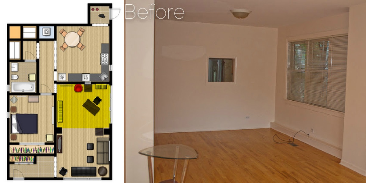
Tiny kitchens are the worst. After a hilarious episode of House Hunters in Minneapolis, I've now re-coined the term "One Butt Kitchen." You know what I'm talking about... those kitchens that are obviously meant for only one butt at a time. Well, that's what we're got to work with. 

On top of being a "One Butt Kitchen," cabinet space was slim pickin's. We installed a spice rack, shelving, and a hanging rack for coffee mugs under a cabinet... but were still stumped as to how to free up space and make the small space we did have more functional. 

One of the biggest "pain points," so to speak, was the pot-and-pan storage. The under-the-counter cabinet situation involved one large but totally not functional space. This lead to piles of pots and pans and the one you wanted was always squeezed between all the others. Everything was a lot of work... and noise...

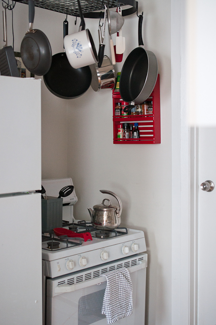
...until I found an amazing deal. I ordered this Innova Classicor Wrought Iron Oval Pot Rack (yes, that's its full name. Sort of like Prince Edward VanHalen Lichtenstein the Third) for under 40 bucks.

We installed it by putting in four hook screws, then hanging the fixture from a large chain.

Before & After:


And of course, I had to grab a shot from underneath. I feel like I should be cooing like a little baby, staring up at my pretty little big mobile.


The light we had initially hung over the stove is now somewhat displaced. It's currently hanging along with a rarely used pot... just in case we decide we still want it and want to hang it more "chic"-ly from the rack. Any suggestions? :)


5.07.2012

Put It On A Shelf

Pin It Print Friendly and PDF
What's the best way to get organized in a small apartment? Get as many spaces and surfaces as you can! Remember our mission to thrift? Our main goal when left that day was to find a bedside table, but we came up short there, and wound up long in the shelving department, and we decided to put those awesome shelves in Justin's apartment. And the kicker? (Cue the heavenly music, please)... they were a piece of cake to install!


Here I am, on the beautiful, fateful day I first eyed my silver shelves... Now, cue the background music, "Silllver shelves.... Silllllvvverrr shhellllvesssss... It's thrifting timmeee in the cityyyyy..." Come on. You totally enjoyed that.

We purchased these shelves without an actual plan for where to put them (but at $12 for all 3 shelves, can you blame us?!).  I considered putting them in the bedroom, which is shaping up to look quite beautiful manly...  but, ultimately, I think I finally realized two things:

Thing Number One:
We all have a part of our apartment or home that is just plain crappy. 

Thing Number Two:
When you love a new piece of furniture, you want to put it in the room you love... but you should put it in your --- you guessed it --- crap room.

What does this mean? It means we decided to put the shelves in the kitchen. The crooked cabinets, old school (and not in a good way) counter top, and please-throw-me-out appliances needed some beautiful company.

We decided to put them above the kitchen sink. There was a large space on the wall, right above the sink, that wasn't being used. The ratio of kitchen items to drawer and cabinet space was depressing (note: that means many kitchen items and very little drawer/cabinet space), so it seemed to make sense to add some beautiful silver (err, I mean manly and industrial) shelves.

In the end, the space looks much better and we've finally got some functional space... not to mention something for our eyes to ponder as we do the dishes.

What we used:
  • Shelves
  • Level
  • Drywall Anchors
  • Screws and washers

We Came. We Saw. We Conquered.
 Or... We eyeballed. We measured. We Hung.

We eyeballed a location for the shelves
We weren't very methodical, we just thought about what we could put on them, and how much height  we would need on top and in between
We measured
Center the shelves between the cabinets
With the level on the shelf, mark the location for the anchors

We hung
Screw the anchor into the wall (Tip: line up the shelf after the first anchor to make sure your mark for the second one still lines up)
Put the washers on the screws
Bolt the screws into the anchor


See how they look as though they're not centered? Let's take this as a teaching moment for a typical old Chicago apartment... the cabinets are not centered above the sink. Thus, neither can the shelves.


4.24.2012

10 Cheap Interior Design Tips

Pin It Print Friendly and PDF
Happy Tuesday, my creative friends :)
Today, I've got a submission from Renee about how to decorate your home without paying a pretty penny. Without further ado, take it away, Renee!


I’m excited and honored to be hanging out at Carly’s Createlive today. I’ve been following her blog for quite a while and she’s just great! 

I’m Renee, author/speaker and blogger over at http://Renee-joyjourney.com. My passion is to help women live in balance, purpose and victory through The {Mommy Makeover} Project … and coffee. 

So today, I’m really excited to talk about how you can make any room pop and NOT pay an expensive designer. I’ve gotten a lot of compliments on my living room. My talented sister-in-law helped me complete it. I learned a ton in the process. But here are my Top Ten Tips! 

  1. Choose your focal point. We chose the center window. The bold drapes and furniture grouping around the window draw the eye. Build everything around the focal point. { I was clueless about focal points until this room project … so don’t feel bad if you’re just getting this too.} 
  2. Select a tight color scheme. A combo that always works is 3 neutrals and 2 accent colors. Okay, let’s see how good you are. Take a look at my room. What are the neutral and accent colors? Where are they located? {Feel free to share below.} Stick to your color scheme and delete the things that don’t belong. This is no-time to get sentimental. 
  3. Flooring. The area rug over the wooden floors pulls the furniture grouping together. Which leads me to number 4
  4. Furniture groupings. You can make a room feel cozy by creating seating areas. A couch doesn’t have to be against the wall, by the way. Oh yeah, don’t forget to actually sit there and chat once you have it arranged. 
  5. Lighting. Add lighting so that you can … see. That’s really important. 
  6. Balance. You want to make sure your room is in balance. My baby grand {my dream come true}, a heavy piece, is balanced by a corner entertainment center, another heavy piece in the opposite corner. You get the idea. 
  7. Pattern. Choose wisely. I had a vision of a room in black and white with swirl patterns. The damask fit the bill. Patterns show up in fabrics and rugs. 
  8. Purpose. What are the different activities that will go on in this room? My living room serves several purposes: reading {book shelf with all my lovely books}, entertainment {movie and wii night}, musical enjoyment and of course conversation and drinking coffee. 
  9. Organization. Store like items in their designated activity zone. The piano books are in the piano bench. The wii games are in the entertainment center. 
  10. Accents. I saved the best for last. Add art and floral accents to your room. Notice that my accents are the red geraniums and the red textured, silky pillows. I also have black and white tulip sketches and a candlelabra. Accents should reflect the “amazing you”. 


Renee, Author/Speaker and Blogger at Http://Renee-joyjourney.com is dedicated to helping women live their dream through The {MOMMY MAKEOVER} PROJECT, a free 20 day ecourse. Her newest book, Total Home Makeover, will be in bookstores May 20, 2012. Learn more at Http://Renee-joyjourney.com

3.13.2012

DIY Decor | Silhouette Wall Art Is Up!

Pin It Print Friendly and PDF


Wooohoooo! It's finally up!!! [Carly jumps up and down while clapping her hands]

A month ago, I created 4 different pieces of silhouette art using real photos of Justin and I and gave him the art for Valentine's Day. By "gave him the art," I mean that I showed him the files and said "I have no idea how to get these printed but here you go..."

Turns out, all we needed was $34.99 and a Zazzle order. We ordered custom-size prints, having sized the art to fit the black Ribba frames we bought at Ikea.  7 days later, Zazzle came through, and a huge cardboard tube was delivered to my cubicle at work.

See how the wall looked before? It was NAKED! NAKED, I tell you! This is not dramatic exaggeration... it truly was bare naked.


8.25.2011

Signature Style Me

Pin It Print Friendly and PDF
I love personality tests (I'm all over the Meyers Briggs tests; any other ENTJs? Yes, you may call me the Fieldmarshall).
I love making and designing my surroundings.
I love pretty things.

So when younghouselove suggested Ethan Allen's super quick quiz, I was all over it. It's a 60 second quiz, I kid you not. They flash you two images and ask you to pick the one that grabs your attention. 


I got multiple responses... Let's just assume that means I'm worldly and varied (as opposed to assuming it undermines the integrity of the test), shall we?!


Thank you, Ethan Allen. You may not be accurate but you are certainly amusing.

What are you? Take the quiz here and let me know if your results were consistent!

8.17.2011

Put A Cork In It!

Pin It Print Friendly and PDF
Remember yesterday's Jewelry Box Makeover?!

As much as I'm sure you guys loved the knob-less jewelry box** (yeah -- right), we had some big dreams for this jewelry box and were determined to make her a true beauty.

**I'm always calling knobs "pulls" and nobody knows what I'm talking about. Grr, okay fine. I'll use the right word, already!


I originally intended to pick out some fancy, possibly crystal-esque knobs from a thrift store or Hobby Lobby, but I'm also always looking out for the cheaper solution (in part because I'm stingy frugal, in part because I'm a recent college graduate and am thus poor as dirt).


I've been collecting wine/champagne corks for a while now and realized the champagne corks look a heck of a lot like knobs! They were originally different lengths (see above), but after a quick visit with a serrated knife, that was fixed (see below).


We had a heck of a time figuring out how to attach the cork knobs to the drawers. Ideally, we wanted to put a screw through from the inside of the drawer so that it was poking out a half inch or so on the outside, then just screw the cork onto it. Due to the size and depth of the drawer (and the fact that we didn't have one of those baby-sized screw drivers you think will never come in handy but actually do), this idea was proving to be pretty difficult to make happen. 

In the end, we sucked it up and just put a nail through, starting from the front of the cork. We had a few mishaps with bent nails (does anyone else have an occasional hate-hate relationship with nails?) and we pretty much guessed on centering the nails (using holes from the old hardware as guides), but it turned out quite fancy looking.

Before:


After:


Distress
We also ended up distressing the box a bit. Due to the vintage feel of the champagne cork knobs and aluminum, as well as the cut of the box, itself, distressing seemed like the right thing to do.

If you've got dreams of distressing a project in the future, keep in mind that distress should be where an object would naturally be distressed. So, hit those corners and edges (and near where we would touch the knobs) with a hammer.


Here it is, in all its glory. The only expense was a $6.00 can of white spray paint -- which we used for only one coat of paint, so it's got at least another project's worth of spray paint in it.
Related Posts Plugin for WordPress, Blogger...
Blogging tips